How to Create Powerful Cohort Retention Graphs
What is a Cohort Retention Analysis
Cohort retention analysis groups users based on shared characteristics or actions within a specific timeframe, allowing businesses to track and understand customer behavior over time. This insight is crucial for identifying trends, measuring the success of strategies, and enhancing customer loyalty. By understanding cohort retention, companies can identify trends, measure strategy success, and improve cohort user retention. However, performing cohort retention analysis can be complex and time-consuming, especially for non-technical teams.
Why Cohort Retention Analysis Matters
Understanding user retention is crucial for any business's growth and sustainability. Cohort retention analysis is particularly powerful because it:
-
Reveals True Product Stickiness -- By tracking how different user groups engage with your product over time, you can measure genuine product-market fit. Evaluate the impact of new features or marketing with cohort retention rate metrics.
-
Identifies Pattern Changes -- Quickly spot if recent product changes or marketing campaigns are improving (or hurting) user retention. Spot patterns in cohort analysis for retention and see how different cohorts behave over time.
-
Guides Resource Allocation -- Understanding which user segments stick around helps focus your marketing spend and product development efforts.
-
Predicts Customer Lifetime Value -- Better retention tracking leads to more accurate CLV predictions and business forecasting.
-
Enhances Customer Loyalty -- Discover drivers of retention using cohort analysis customer retention and address churn via cohort retention curve insights.
How to Conduct Cohort Retention Analysis Easily
You don't need to be a data scientist to perform cohort retention analysis. Here's a straightforward approach:
-
Define Your Cohorts -- Group users by sign-up date (e.g., monthly). This helps create a cohort retention graph, cohort retention chart, or cohort retention matrix view.
-
Select Key Metrics -- Decide which retention intervals you'll analyze -- daily, weekly, or monthly -- for your cohort retention analysis. CamelAI can help with cohort retention for Excel or cohort retention with SQL.
-
Gather Your Data -- Pull data from user retention tools like Google Analytics, BigQuery, Looker, or spreadsheets. You can also run cohort analysis SQL queries directly.
-
Visualize the Data -- Create a retention table showing cohort retention over time. Use color gradients or a cohort retention curve to highlight patterns.
-
Analyze and Act -- Look for changes in cohort churn analysis or improvements after product updates. If you're running a cohort analysis subscription business, note which cohorts renew at higher rates.
Creating Cohort Retention Graphs with camelAI
Gone are the days of wrestling with complicated UIs like Google Analytics and writing complex SQL or Excel logic. With camelAI, you can create detailed cohort retention analyses through simple conversation.
Connect Your Data
Linking your data sources to camelAI is seamless and supports a wide range of platforms. Whether you're using Google Analytics for user retention by cohort, BigQuery for cohort analysis, or traditional databases like Postgres, MongoDB, MySQL, and Snowflake, camelAI has you covered.
We also support modern data warehouses such as MotherDuck and ClickHouse, as well as data integration tools like SingleSource and Peliqan. Additionally, you can effortlessly upload data from CSV and Excel files for comprehensive cohort churn analysis.
By supporting these diverse data connections, including Supabase, camelAI enables you to perform customer cohort analysis without the hassle of switching between multiple platforms. Whether you're leveraging Looker for visualization or utilizing SQL for deeper insights, camelAI integrates smoothly to provide a unified experience.
For subscription-based businesses, our tool excels in cohort analysis for retention, allowing you to track retention rates and visualize cohort retention curves with ease.
Step-by-Step Guide
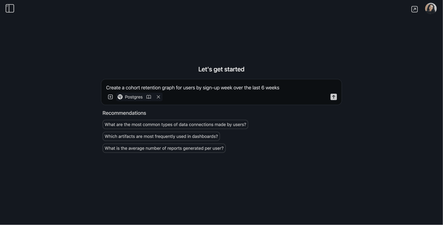
- Start the Conversation -- Initiate your retention analysis with a simple question: "Create a cohort retention graph for users by sign-up week over the last 6 weeks."
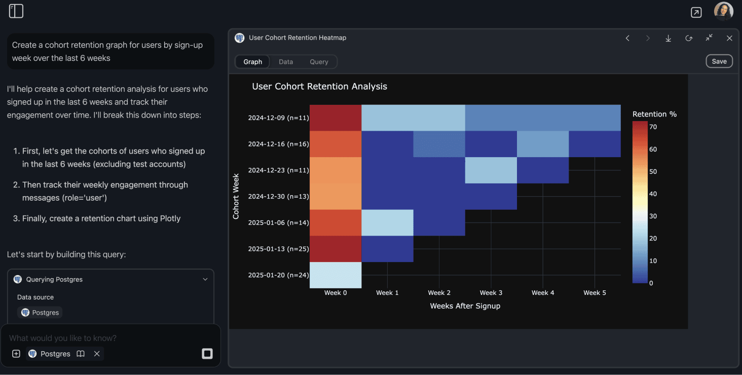
- Watch the Magic Happen -- camelAI automatically generates cohort analysis SQL, returning a cohort retention chart or cohort retention curve through an interactive Plotly visualization.
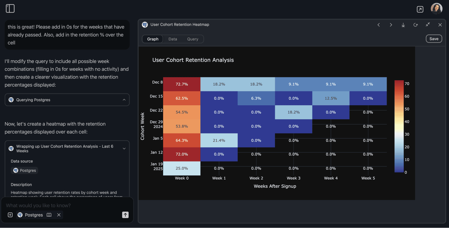
- Customize Your Analysis -- Tailor your cohort analysis to meet specific needs by modifying time periods, grouping, or focusing on particular user segments. For example, conduct a cohort retention analysis for a subscription business use case to understand user retention among premium subscribers. Whether you're performing a cohort retention analysis in Excel or using cohort retention SQL, camelAI offers the flexibility to dive deep into your data.
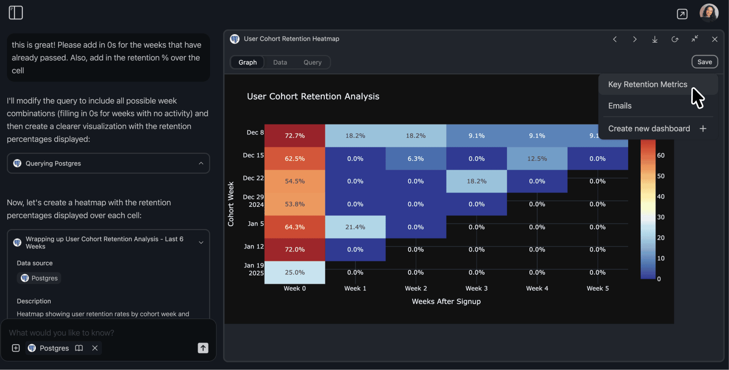
- Share and Monitor -- Any artifact generated through the AI chat can be saved to a dashboard, allowing you to monitor cohort analysis retention rates in real time.
Our native dashboard tools ensure that your cohort retention SQL queries are always up to date, providing you with the latest insights every time you view your dashboard. Whether you're using Tableau for advanced visualizations or our built-in tools, camelAI makes it easier than ever to conduct customer retention analysis examples and track the performance of different customer cohorts.
Example: Customer Retention Analysis
Imagine you're a product manager wanting to understand why a particular customer cohort is experiencing higher churn rates. With camelAI, you can perform a churn cohort analysis by simply asking the chat agent.
The tool will generate the necessary SQL queries, visualize the cohort retention graph, and provide actionable insights, all without writing a single line of code.
Benefits of Using camelAI for Cohort Analysis
- Efficiency: Create cohort retention graphs and customer retention cohort analyses through intuitive conversations.
- Flexibility: Connect to a wide array of data sources, including Supabase, BigQuery, Looker, and more.
- Visualization: Generate interactive cohort retention charts and curves with Plotly, enhancing your data storytelling.
- Real-Time Insights: Save artifacts to dashboards for continuous monitoring and up-to-date retention rates.
- Ease of Use: Perfect for non-technical executives, founders strapped for time, product managers, and beginner data analysts.
With camelAI, performing cohort analysis for retention or creating a customer cohort chart has never been easier. Say goodbye to manual data manipulation and hello to intuitive, AI-powered analysis.
Ready to analyze your user retention?
Get started for free: Sign up for camelAI and start asking questions about your data today.